01
Core Content Production
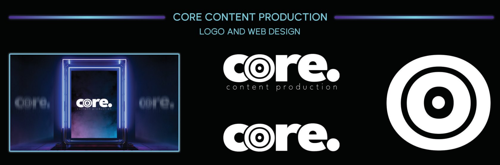
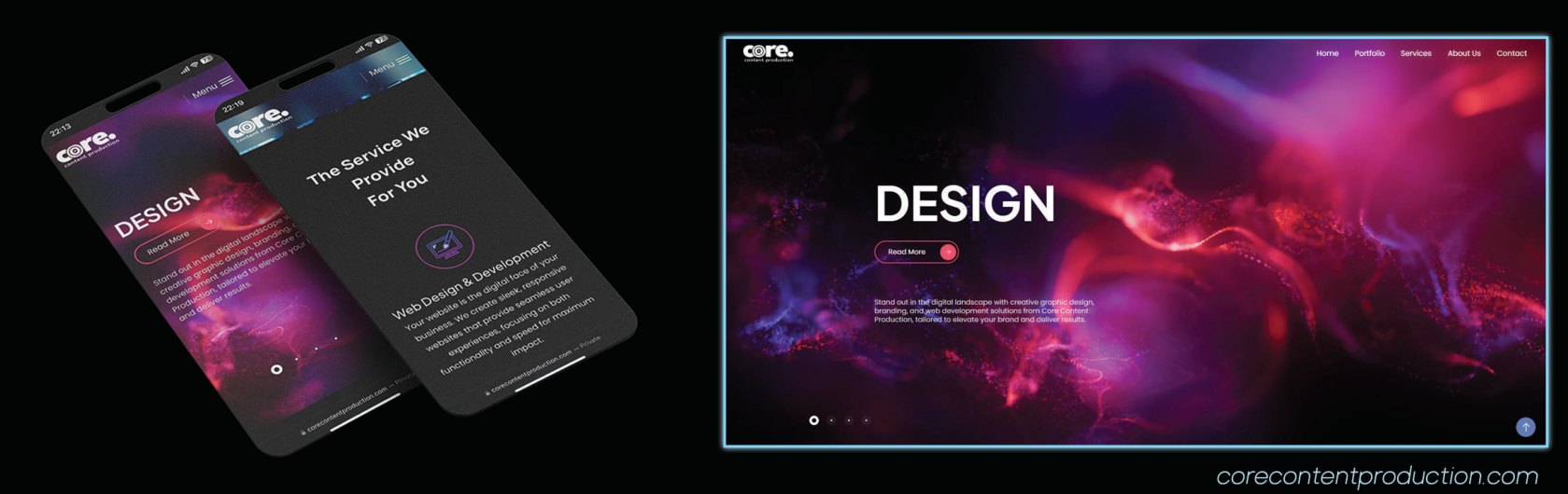
Logo system and full web design for my own agency — the neon target mark, the wordmark, the site. Wound down in 2025; the brand stays a favorite.
Everything I ship looks the way it does because I spent a decade as a working designer first — Photoshop, Illustrator, brand systems. This is the visual record.
Logo system and full web design for my own agency — the neon target mark, the wordmark, the site. Wound down in 2025; the brand stays a favorite.
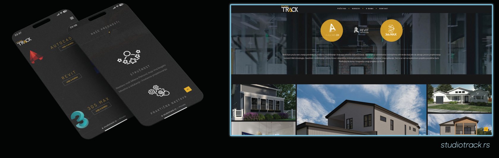
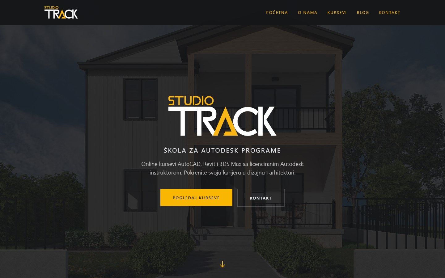
Gold-on-black identity and the original website for an Autodesk school — bold geometry, course cards, the works. It has since been redesigned (its own Next.js rebuild) and is live today.

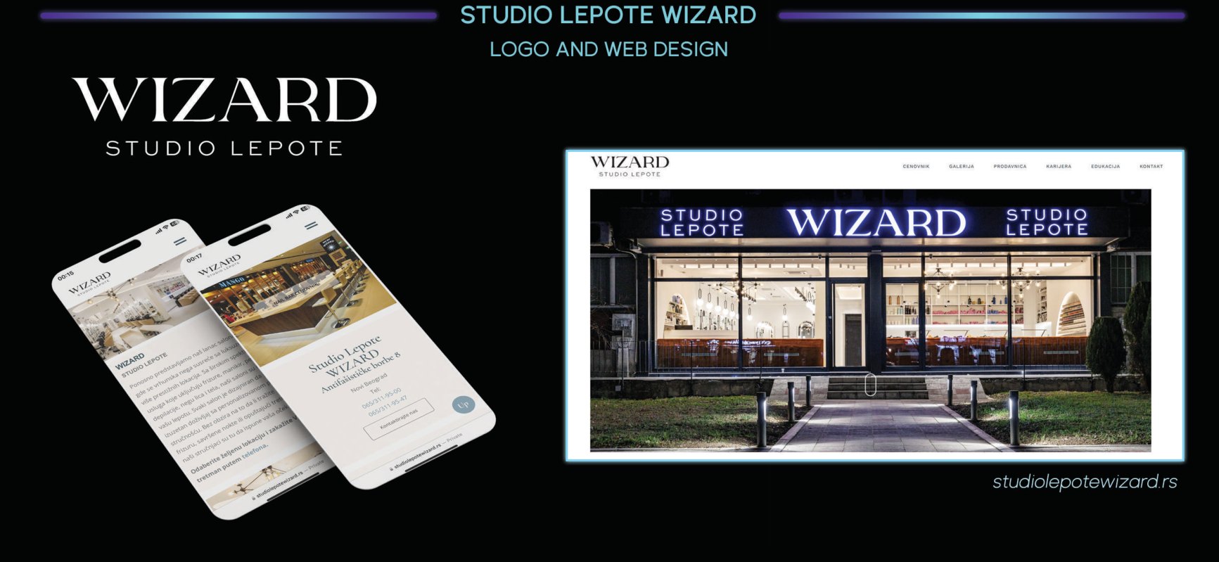
Serif elegance for a Belgrade salon chain. Honestly stated: I consulted on the new logo and identity through their rebrand, and for the website (studiolepotewizard.rs) I specified every page, prepared the content, tested it — and still maintain it today.
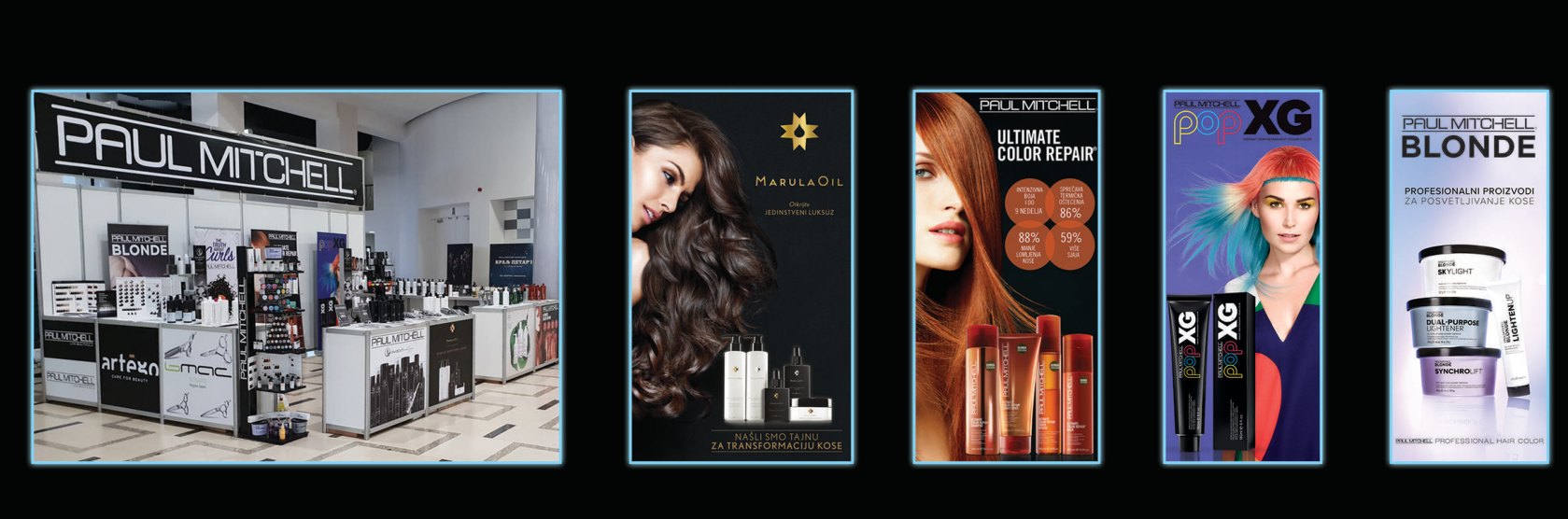
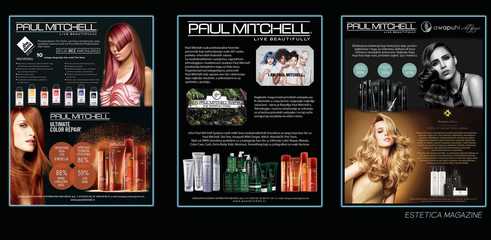
As Operations & Creative Manager for one of Serbia's leading beauty companies, I designed print and digital — trade-show booths, retail graphics, and Paul Mitchell campaign spreads that ran in Estetica Magazine.
My personal mark — the reduced Planck constant, chosen because it echoes the Cyrillic Ć in my surname and because I like symbols that carry more than one meaning. It signs everything I build. (Why that symbol, of all symbols? Some things stay off-world.)
The dark-cosmos language of SYNAPSE, the gallery-midnight theme of dusandpetrovic.com, SteTalk’s neon palette — all designed, not templated. When I direct AI agents, the pixels still answer to me.